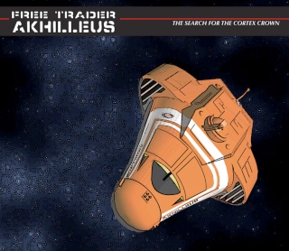
Cover Page
3 posters
Page 1 of 1
 Cover Page
Playing with a front page/cover
Still undecided about the typeface but it feels generally quite CT
(Forward turret and new spelling now included)

Still undecided about the typeface but it feels generally quite CT
(Forward turret and new spelling now included)

Beech- Posts : 146
Join date : 2008-03-24
 Re: Cover Page
Suggest dropping the achilleus as it might be confusing for the first issue. But that sort of title should be kept for when the Achilles visits a low-tech world at some point. Looks awesome!

Baron Saarthuran- Posts : 88
Join date : 2008-03-24
 Re: Cover Page
Ok, so for our first release, Its:
a Cover (easy no Dialog)
A "splash" page? (A one page maybe with one side with wide scope pictures of the Crowns history, and the other side an easy to digest "Free Trader Beowulf" style backstory of it.)
First Page that introduces the Characters (maybe they all recieve the same Xboat message?)
Second Page that starts to get them in with the Duke?
The Process ?
We discuss Panel configuration/character blocking. Beech begins character layout
We get to work on dialog, keeping readability and natural speech in mind when doing it.
Beech get the art done and everyone else gets the dialog/script edits done
Final formatting and Beech seal of approval.
Off to release!
Repeat until hospitalization occurs.

Baron Saarthuran- Posts : 88
Join date : 2008-03-24
 Re: Cover Page
Akhilleus sounds really cool, too tho. now that I am really looking at it. It has the look of ancient history viewed from the 57th century about it.
Also, CT feel is right, and Hats off to ya for it! A really top notch job! Seeing something like this makes me wish the collected Traveller people had the resources or inclination to fund a proper art department to define its "look", and they got Artists like yourself to work in it. Good show!
Also, CT feel is right, and Hats off to ya for it! A really top notch job! Seeing something like this makes me wish the collected Traveller people had the resources or inclination to fund a proper art department to define its "look", and they got Artists like yourself to work in it. Good show!

Baron Saarthuran- Posts : 88
Join date : 2008-03-24
 Re: Cover Page
Aw thanks (blush)Baron Saarthuran wrote:
Also, CT feel is right, and Hats off to ya for it! A really top notch job! Seeing something like this makes me wish the collected Traveller people had the resources or inclination to fund a proper art department to define its "look", and they got Artists like yourself to work in it. Good show!
Thing is if we get this thing going successfully we can become a big part of defining the look (far more than the Mongoose stuff will do) just by amount of illustrated material we would be putting out, also this means we get to define it our to our vision too!
Beech- Posts : 146
Join date : 2008-03-24
Page 1 of 1
Permissions in this forum:
You cannot reply to topics in this forum